Top web design trends in 2017
Jul 14, 2017, by admin
Website trends changes every now and then for good. With half of 2017 gone now, we will be looking at design trends that capitulated us.
Typography in shared spaces
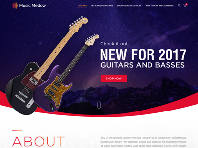
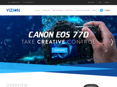
The unwritten norm for typography is that it is written across one element. However, we seen to gotten over to break the norm, and lettering it across multiple boxes. It can either be in a split screen boxes or move into another elemental picture, say that of a picture. The results however have been brilliant.
The main advantage of this trend it adds focus to the text without compromising the image content. You will still get an aesthetic site with text also getting equal attention if not more than the images.
The messages are ideally a short tidbits. The effect of typography can only be fully put to effect if the background images were off the similar shade. Shade variants may put extra weight on the pictures which will diminish the effect of texts and typography.
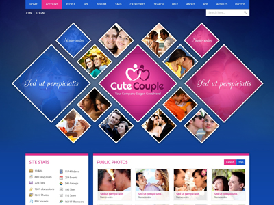
Nothing paints a more vivid imagery than a polygon. Random polygons across the sliders with different colours or shades paint a soothing yet rebellious picture. The section easily grabs the attention of the users and deliver the information on the site to your users.
Polyshapes are even added to videos, images of objects to add a bit of panache to the design outline. Best way to use the polygons is add them on designs that are a bit flat. The navigation across the site is enhanced by the use of them polygons.
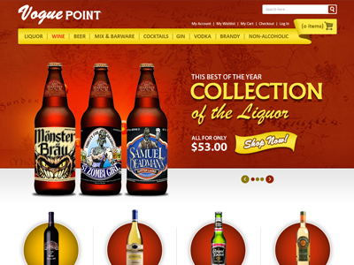
When your design is to be maintained flat an d professional, the use of gradient is hardly bettered. The colours overlay themselves to form an interface that is close to perfection. When you compare the newer gradient to the older gradient designs, the colours are more vivid and are bold and often include two contrasting colours.
Ideally you would have a single colour gradient for smaller elements and contrasting and bold gradients for larger elements.
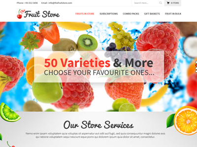
How would you want your content to stand out in your website? Simple, use bold colours. They just seem to be all over the place these days. Bright colours are used for versatility in backgrounds, font colours, buttons and landing pages.
The use of neons have also been catching up again. They have been used in logos and to make accents.
Navigation panels have been subject to experiments. Conventionally you would never want to stray your menu too far from the top your page. But with more and more emphasis on the landing pages, menu’s have been shifted to side panels or even bottom panels to the landing page.
In some cases absolute random menu boxes have been placed to give a bit of character and uniqueness to your website.
We are expert website developers who emphasize on understanding the trends and combine it with your web content to bring you the best website you can possibly have. Have a chat with one our representatives. I am certain they will help you get a picture of your website in way no one else will.You can find us at www.bugtreat.com or contact us via
Have a look at our website and let us know if there is any queries that you have got on this regard.
email:support@bugtreat.com
phone:91 452- 425 0250


